
Career Hub
Mobile Redesign
Overview
The Problem
Eightfold Career Hub is a comprehensive platform aimed at supporting the professional growth of internal employees within enterprises. The mobile app was launched in June 2021 and has undergone multiple updates and releases, yet the adoption and retention rates of users remain low.
The Goal
To improve task completion times, increase completion rates, reduce error rates, drive adoption, and enhance retention by creating innovative user-centric solutions through empathy and iteration
The Solution
I aimed to improve user efficiency through the redesign of CareerHub's homepage by incorporating personalized layout, enhanced profile completion, strengthened relationships, and fun elements. I used empathy and iteration in the design process with the goal of driving adoption, enhancing retention, and improving task completion times, completion rates, and reducing error rates.
Timeline
Summer 2022
5 Weeks
My role
Product Design Intern
Collaboration
Project manager, UX Researcher, UX Designer, Engineers
Responsibilities
UX Research, Usability Testing, Wireframes, Prototyping, Visual Design
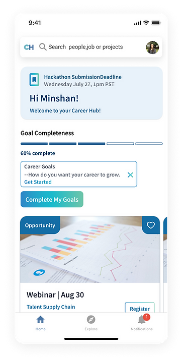
Profile completeness & Customizable banner
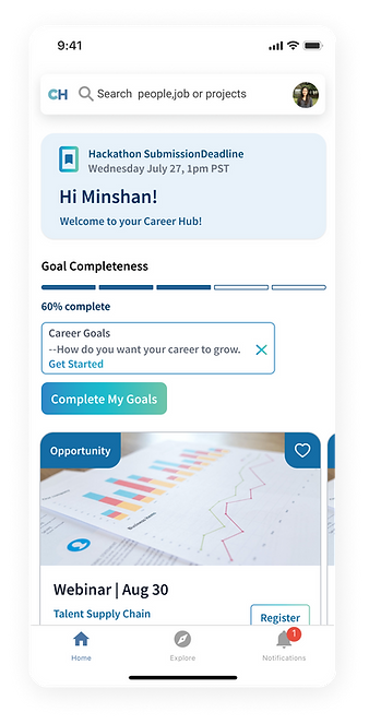
" I am feeling frustrated because my incomplete profile is preventing me from achieving my career goals. This lack of clarity is impacting my future career prospects." (Participant 4)
This revised version provides a clearer and more straightforward description of the two sections.
-
Customized Profile Banners
-
AI-Powered Summary and Completion Tracker

Personalized Homepage Layout
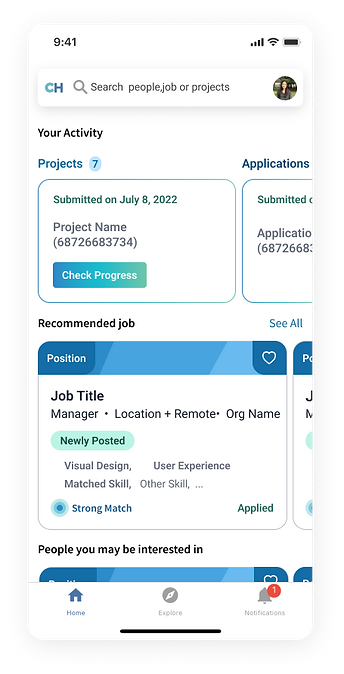
"I think that there could be items that are frequently used on top of the Career Hub" (Participant 1)
The revised version provides a clearer and more concise description of the section in which the system remembers the preferences of users.
-
Streamlined Navigation
-
Personalized Homepage Layout
Content Enhancement
"I thinks everything is relevant, but needs a bit more configured" (Participant 5)
This revised version offers a more precise and concise explanation of the section that captures the user's attention and indicates its relevance.
-
Relevant and Matched Button
-
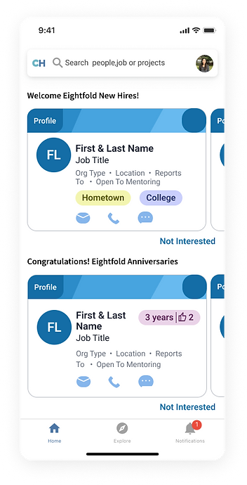
Encourage employee connection

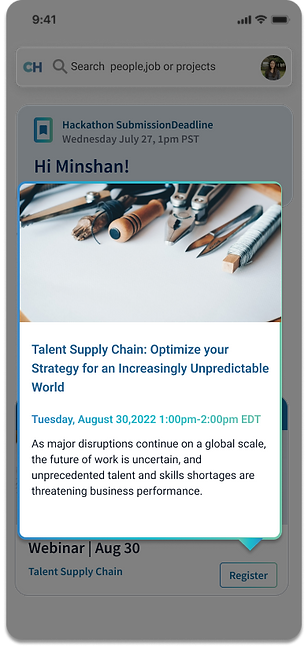
Mobile Only Gesture
“Having the option to take action within the app instead leads to web end login again”. (Participant 5)
This feature enhances the user experience by offering quick and convenient access to event information within the app, without the need to log in to a separate website.
-
Mobile gesture - force touch
Project Timeline
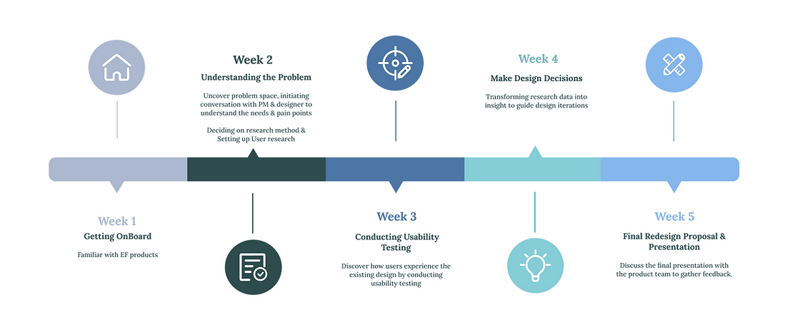
How did I come up with the redesign solution?
1. Scoping
I kickstarted the project by fostering collaboration and open communication with the PM and other key stakeholders. I sought to gain a comprehensive understanding of previous initiatives, the current status of the homepage, and the overarching objectives to ensure a seamless user experience.
2. Research
After collaborating with the project manager and designer, I gained a comprehensive understanding of the system. To gain further insights, I conducted a comparative analysis to evaluate the available alternatives on the market and compare their user experience with our application. After consulting with the user experience researcher, we determined that conducting usability testing would be the most effective method to meet our research objectives and observe user interactions during the tests.
3. Discover & Synthesize
For usability testing, I selected 5 participants from various departments and sectors in the company to get a well-rounded evaluation of the product's usability. To manage and analyze the feedback effectively, I used a color-coding system to identify important areas easily.
- Positive aspects - Pain points - User motivations
During this stage, I employed affinity mapping to categorize and organize the notes from the testing into two overarching themes. These themes were further refined by clustering the notes into specific topics. The feedback and insights gathered from this synthesis process informed my ideation of potential design directions.
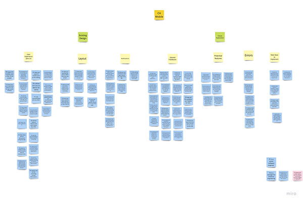
P2 believes that getting notifications can really improve his usage of the app.
P5 "I could be notified on the day of the anniversary of those with whom I work with."
P5 thinks using visuals as motivation could be a more effective way to encourage users to update their profiles
"Having the option to take action within the app instead leads to web end login again” according to P2.
"A window that can be customized for each section may make it easier for users to choose".(P1)
Direct quote from Usability testing
Research Insights
-
3 out of 5 participants expressed the need for enhancing the overall user experience of the application.
-
Participants recommended strengthening the enforcement of app notifications to ensure that users are alerted in a timely manner.
-
Users provided constructive feedback on improving the functionality of the product.
4. Ideate
After presenting the results of the usability testing to the user experience researcher, product owner, senior designers, and development team, we worked together to identify the primary focus areas for the redesign, considering factors such as the project timeline, technology constraints, and the overall product vision.
Based on user feedback and discussions with the product team, I have identified 3 key areas for improvement:
-
Overall layout of the homepage
-
Completeness of user profiles
-
Content enhancement
- Overall Layout
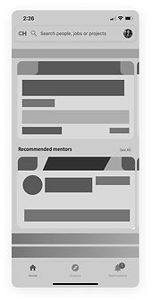
To accommodate the unique needs and preferences of our users, we have categorized the homepage layout using data from our backend. Additionally, users can collapse sections that are of less interest to them. The system automatically saves their personalized layout for future reference and provides reminders when new events are added.
- Profile completeness & Customizable banner
The app's goal is for users to complete their profile, but the competition rate is low. Participants expressed frustration about incomplete profiles hindering their ability to find jobs that align with their career goals and reach desired seniority levels. Some suggested using visual motivators to encourage profile updates.
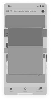
To address this issue, I redesigned the Profile Completeness section and added descriptive text to help users understand where they left out information and what is needed to complete their profile.
- Content Enhancement
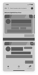
Upon realizing that more than one user would benefit from content customization, I decided to enhance the content in order to increase user interaction with the app.
The aim is to facilitate easy user access to company events, employees, and projects, while providing relevant and concise section descriptions to them.
6. Final Deliver
With the aim of addressing the pain points identified, I created high-fidelity designs for review by the development team. These designs included suggestions for improvements and new features. After presenting these designs to the product and development teams, I incorporated their feedback through an iterative design process.
Impact
From the User Side:
-
Improved experience with efficient features and user-friendly interface
-
Tailored features for individual user needs and preferences
-
Increased engagement and satisfaction
From the Product Side:
-
Boosted user interaction and adoption Increased user interactivity rate 5%
-
Enhanced growth potential
-
Improved employee awareness of company events and strengthened company culture
-
Reduced user frustration and high retention rate
Insight
-
Research findings can inspire design concepts that go beyond the homepage.
-
A thorough design approach should incorporate research findings and user feedback.
-
In some cases, the goals of an enterprise company may not align with the goals of the end-users.
-
Collaboration between content and design system designers is crucial to create cohesive components.
-
Design stories should be meaningful and connect with users by meeting their needs and expectations.
